
Solution Pages Redesign
2021 CASE STUDY
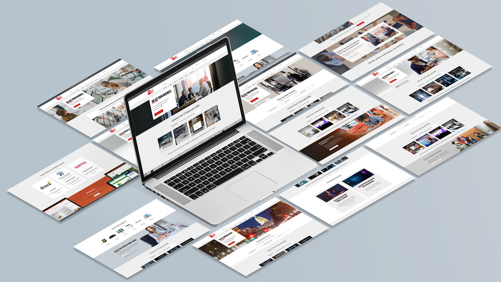
Solution pages deliver research content related to tech solutions across various markets and industries CDW serves. Our customers benefit from updated information from multiple tech sources that helps them decide the best solutions for their needs.
Opportunities
- Solution pages required a new layout that could handle more content while remaining easy to scan, read, and digest.
- Current primary and subpage navigation is causing frustration among users, leading to navigation difficulties and friction.
Solution
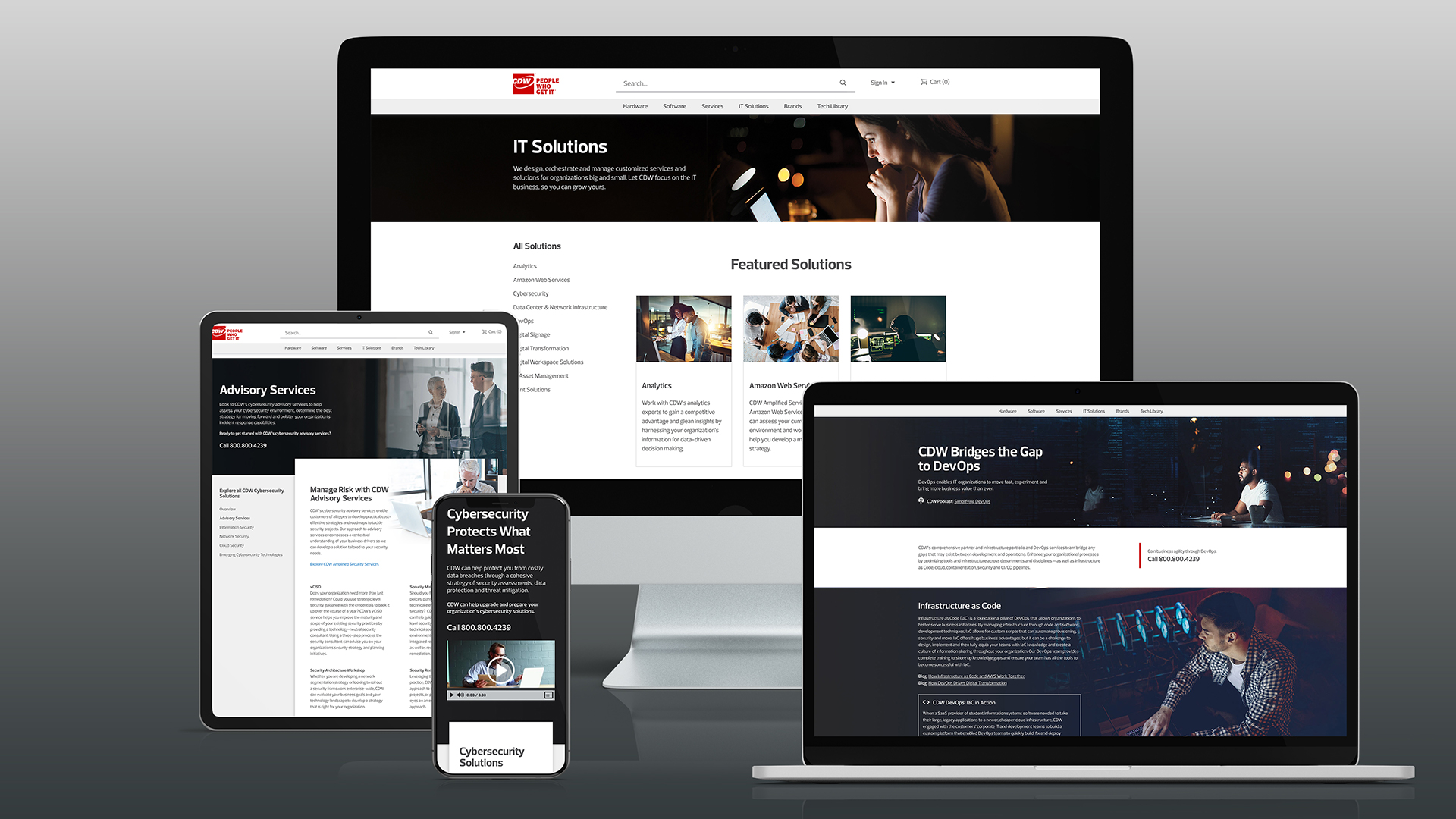
Leveraged a vertical card pattern to allow for more content and a sticky side panel to create a fixed location for links, improving subpage navigation.
Outcome
Increase in the number of views and overall visits for the Cybersecurity and Data Center Solutions pages.

Story

Internal stakeholders owning these solutions pages realized a need for an update not just on content but also on layout. The primary goal is to enhance SEO and provide a content-focused experience. Due to traffic, Cybersecurity and Data-Center Technology are considered high-priority pages.
The overarching goal is to redesign these tech-solution pages to accommodate a higher volume of content while providing an enhanced user experience.
To achieve this, I needed to understand the amount of content, how our visitors view the content, and our messaging tone. These resulted in an update of 17 web pages taking four months to complete from design to launch.
Thinking through the problem
To kickstart the project, the content team met with the stakeholders to obtain the project requirements. Afterward, I met with my content partner to discuss the proposed requirements and review the current experience. We discovered that each of the solution's suites is either a single-page or multi-page experience.
We realized that we need to accommodate these varying experiences, and the content needs an update and a layout adjustment to enhance the user experience.
Let’s draw it out first.
Through collaboration with stakeholders and content-strategist, I first draw out some possible quick layout concepts while studying CDW’s current web design patterns as possible solutions.


Out of many came 3 in greyscale.
Sketch 3 was the best solution for organizing the content on the right-hand side of the page and breaking it down into smaller, more manageable pieces. To better understand how the new content would look in this layout, I created a greyscale version of the sketch. Ultimately, I decided on layout 3 because it met all of the goals for the project's layout.


How we solve it
Allow our visitors a way to navigate within a solution or service.
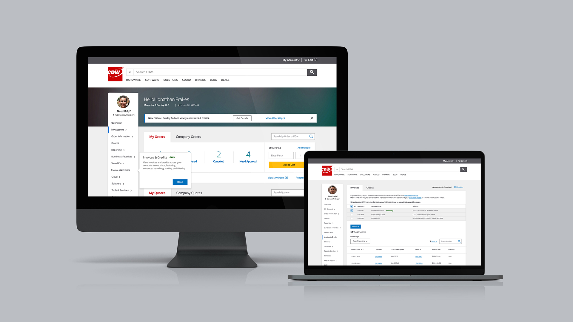
We understood that we needed a way for our users to navigate the experience quickly regardless of where they are on a solutions page. I created a side-sticky nav bar that follows a page's primary content module and allows our visitors to jump to any subpages on a solutions page as a solution.

Provide shopping opportunities for affiliated products.
We also identified an opportunity to cross-promote products that match the solution's content and relevant to our visitor's interests. I created shoppable moments within the primary content module that, on a click, directly lands on a search engine results page (SERP) featuring a selection of relevant products.

Easily scannable content.
As for the primary content, I created an AEM module housing a solutions page's main topics. I collaborated with the stakeholders and the content team to find the right balance of volume and length to deliver relevant information in an easily scannable format.

Create visual cues for visitors to identify downloadable or interactive content.
Finally, I needed to find an approach to highlight engagement assets without adding to the volume copy. I used specific icons for visual identification and description.

Outcomes
6.3%
Increase in direct traffic for Cybersecurity.
10.2%
Increase in direct traffic for Data-Center solutions.
What else is left?
Our goal is to track and optimize the content experience consistently. Due to the increase in mobile visits, migrating these experiences to a new digital responsive framework was timely.
Also, we learned that the content team needed to establish a process or cadence of content-refresh ensuring timely information and continuous user engagement. Finally, I learned to develop a more nuanced approach to my design process.
I learned to accept that every project or step in the project doesn't always fit nicely into a neat design process or flow. These projects allowed me to tailor my approaches to multiple stakeholders with varying overlapping interests.
I learned that to advocate for the end-to-end user experience successfully, I need to include competing business goals and tech constraints to my design considerations.
Selected Works
Created in Earth, Sol System
