Bonzah
2018
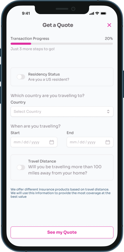
Bonzah is a car rental insurance broker. Their mission is to create alternative insurance options. They currently transact via a responsive website with a 27% rate of return customers.
Opportunities
- Bonzah required a native mobile application to complement their web services.
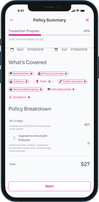
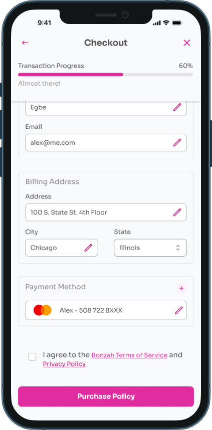
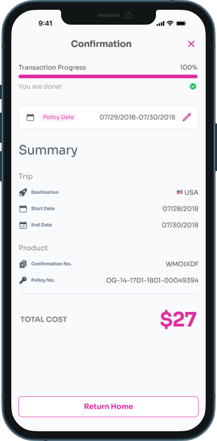
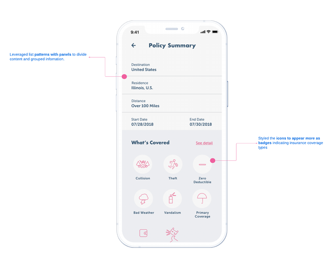
- The app needed to be designed for users who are on the go, making it easily scannable and digestible while still providing all the necessary information.
Solutions
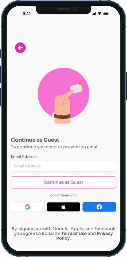
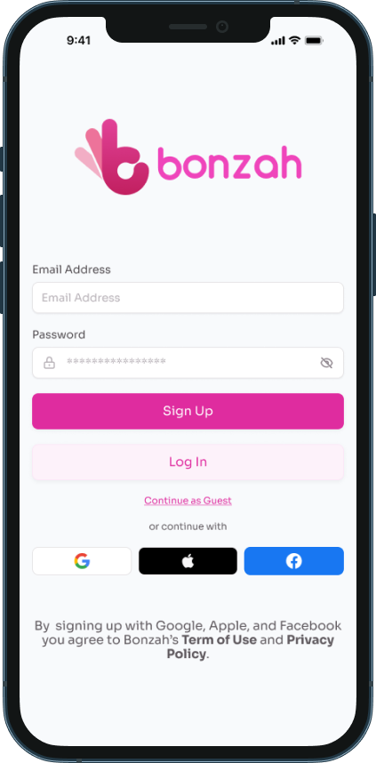
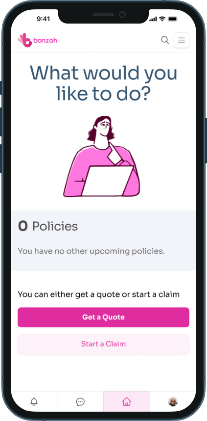
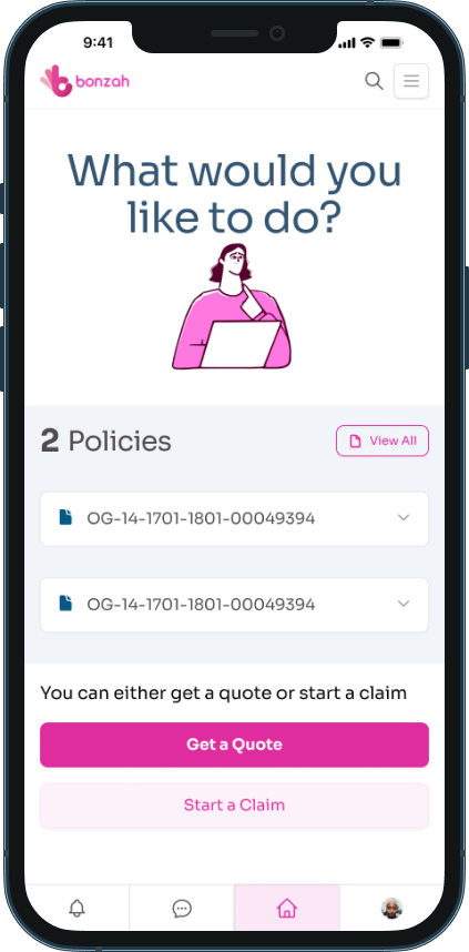
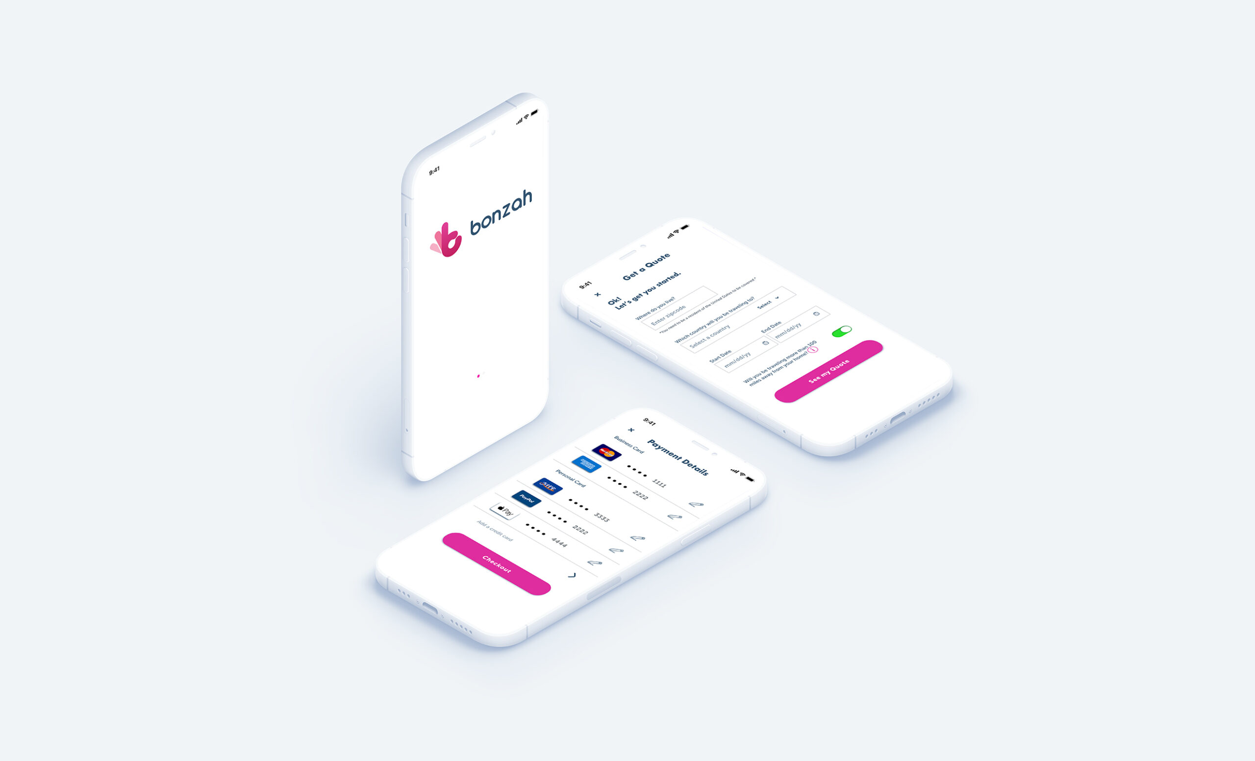
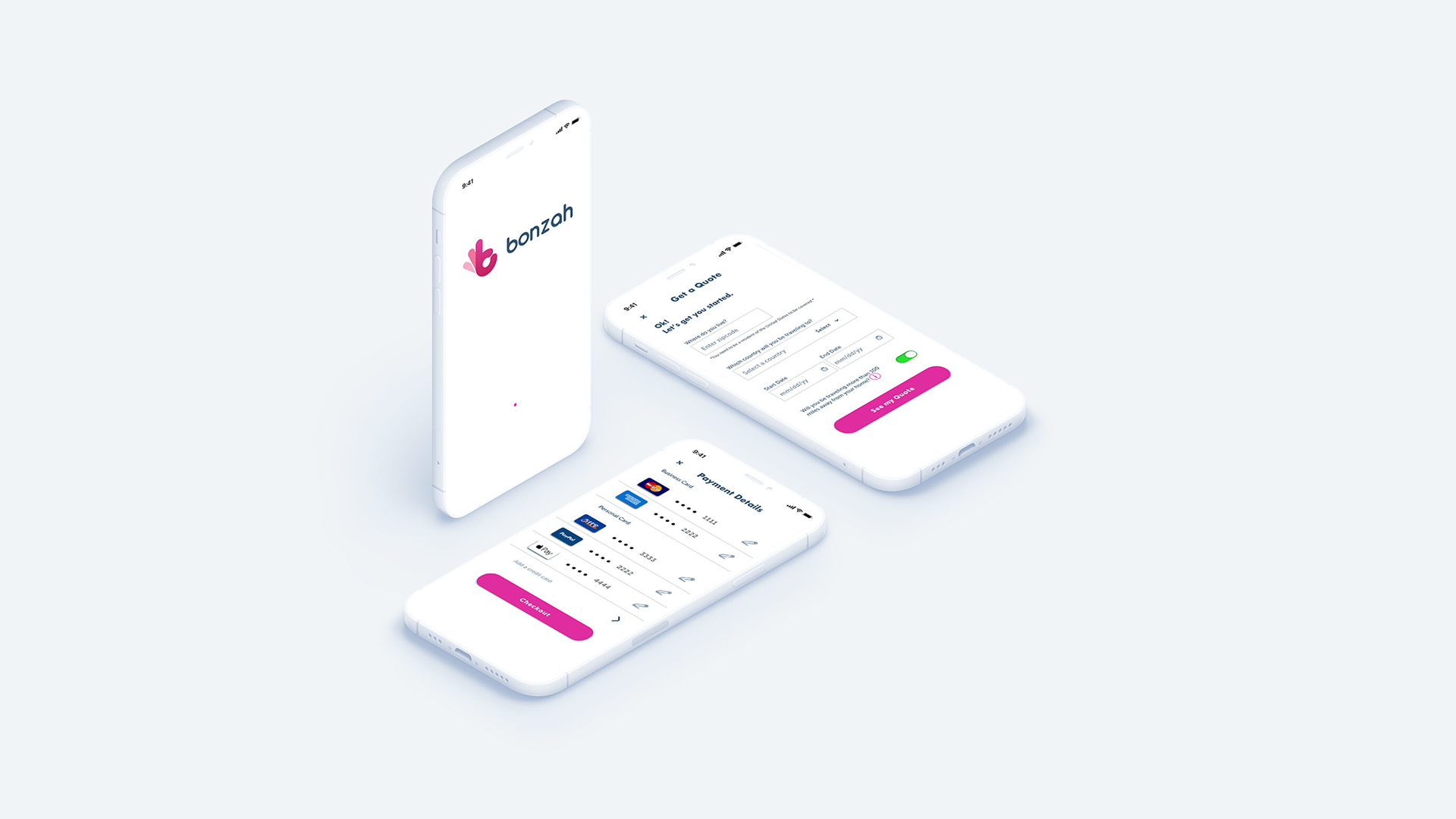
Leveraging form patterns, typography, and illustrations to create mobile designs for development.
Outcomes
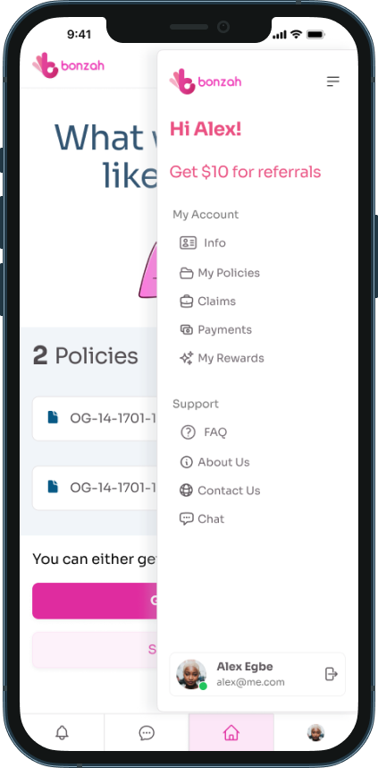
The application can be found in the Apple store for mobile and tablet devices.
2024 Concept Redesign. Continue scrolling to read the full product story.
Story
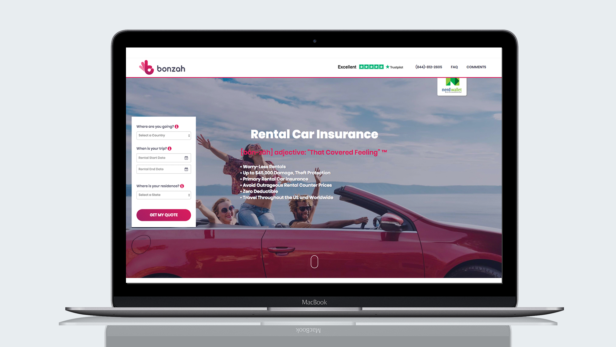
Bonzah specializes in providing exclusive car rental insurance options, and its website boasts a remarkable 27% return customer rate. Despite having already carried out user research, iteration, and prototyping, they wanted to take their development to the next level by incorporating visual designs to enhance the design's user experience.
After analyzing the information, we concluded that convenience of use is a top priority for Bonzah's clientele, which should be reflected in the visual design.
Thinking through the problem
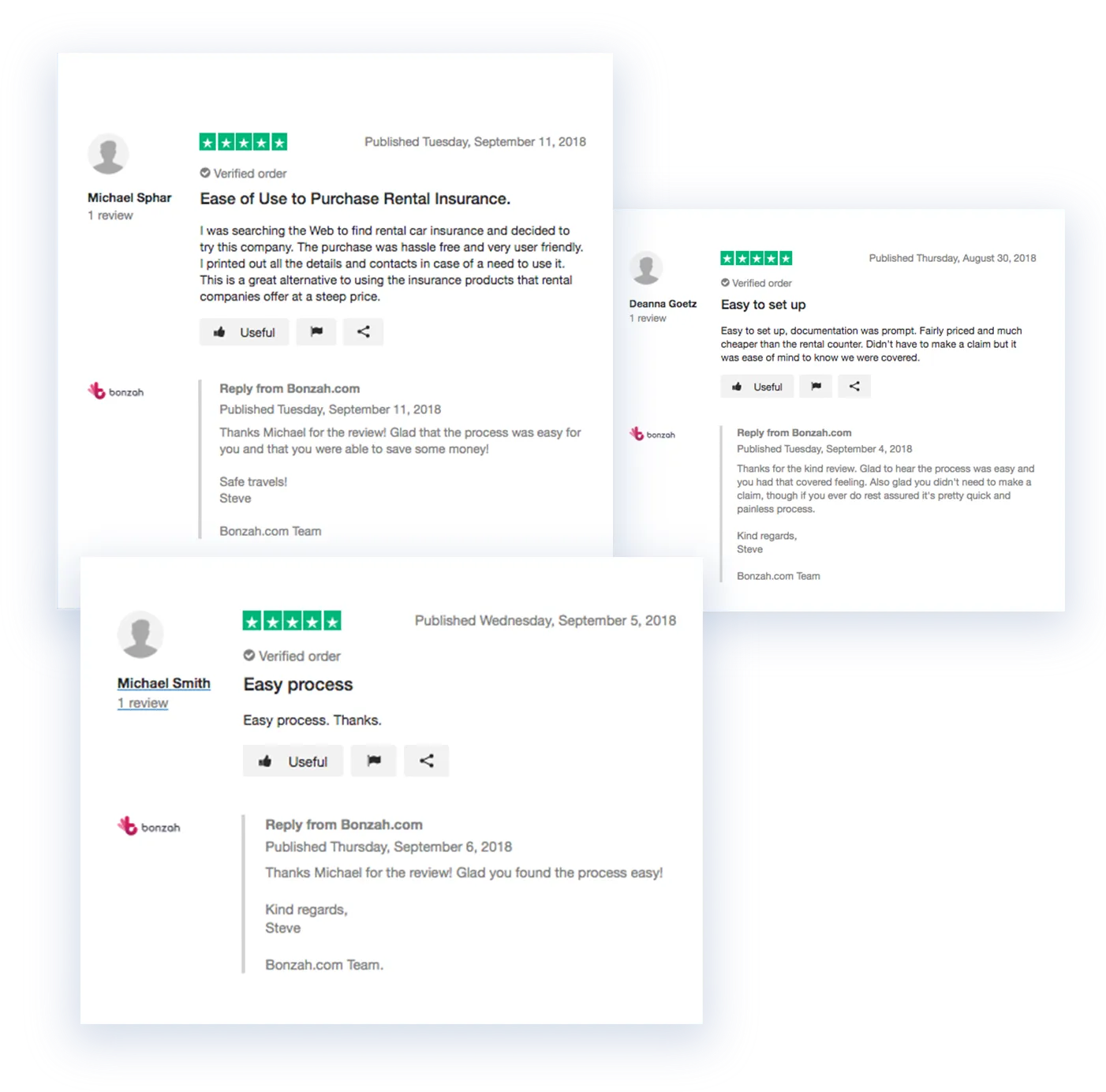
To understand the project's scope, we initially reviewed the previous UX team's user research to understand Bonzah's client goals and needs. Based on Trustpilot reviews from their clients who purchase insurance via their website, we discovered that they prioritize learnability and ease of use. We needed to ensure that experience translated to their mobile experience.
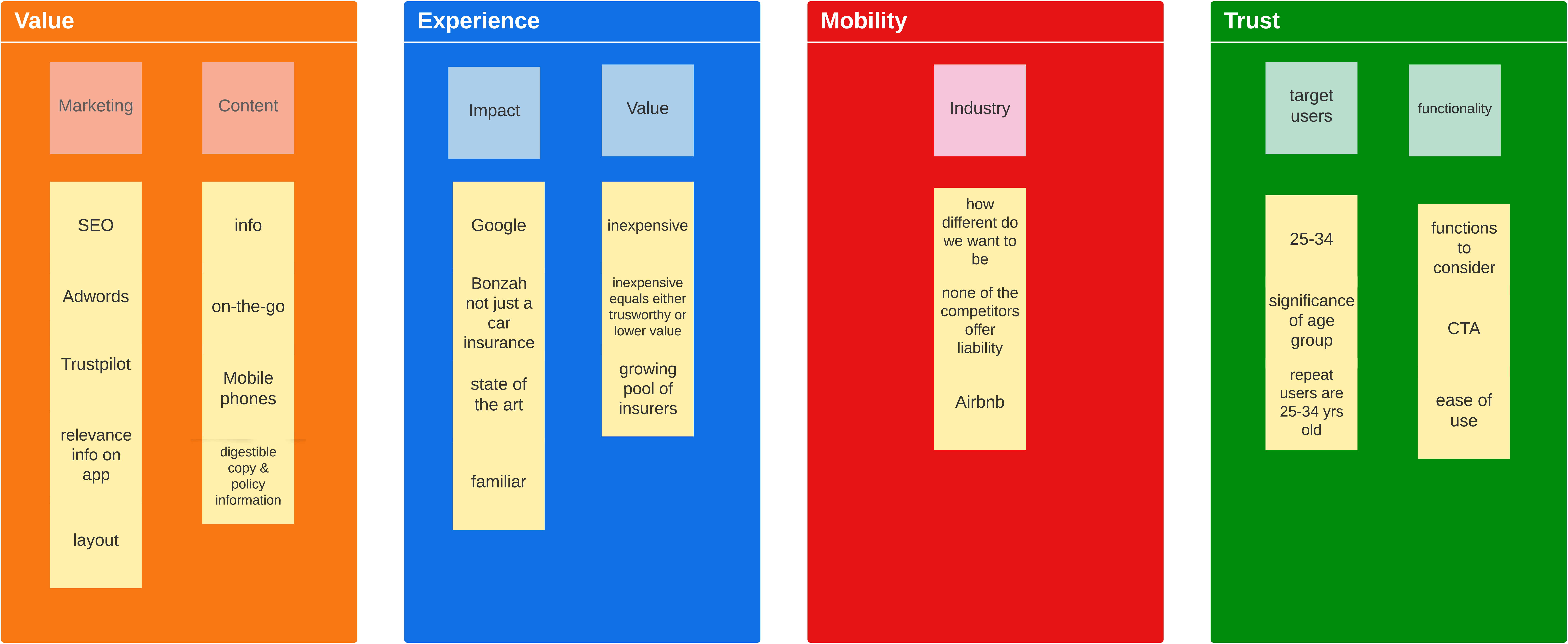
Making sense of all the data
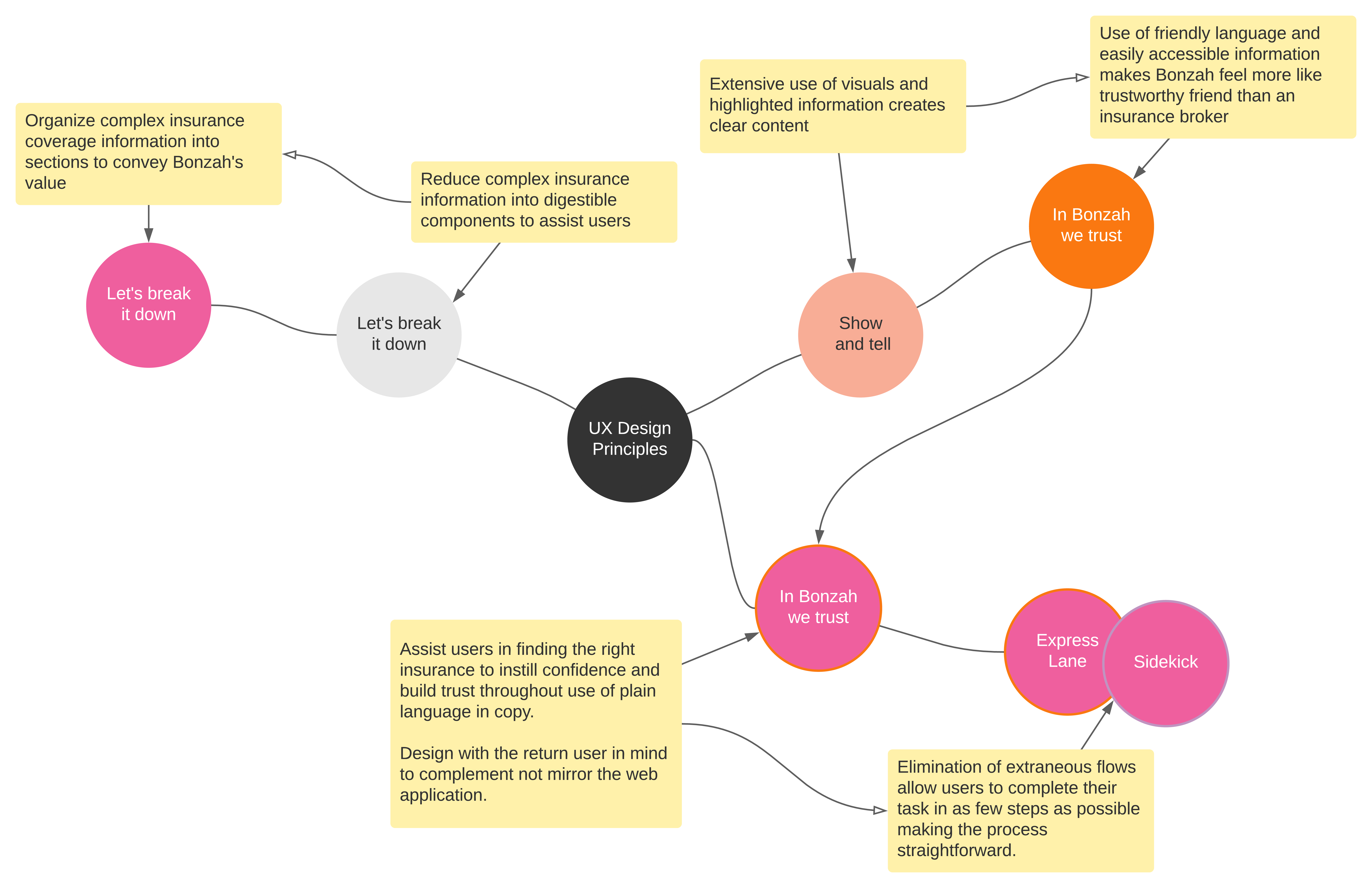
We took all the current information and created theme buckets for all the data to develop potential visual solutions. After data review, we discovered that Bonzah's users distrust complex policy information, and trustworthiness was a key concern. SME research showed that insurance policies are complex and need to be digestible. Most of Bonzah’s users are between the ages of 25 and 34. This insight created an additional challenge of translating and carrying through the usability requirements to desirability. My team needed to discover a way to provide a visual solution that supports what users like about Bonzah while addressing its customer concerns.
Gauging Bonzah's aesthetic sense and preference
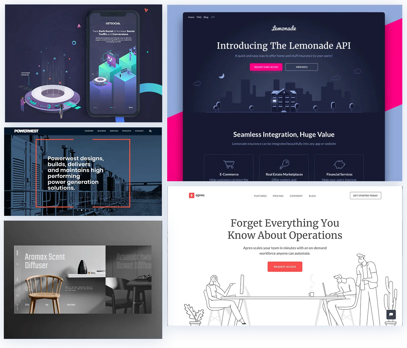
To determine Bonzah's preferred visual design, we conducted a visual evaluation by having the stakeholders react to static images of various landing pages. Our findings revealed Bonzah prefers websites incorporating illustrations, soft colors, and ample negative space. Based on this information, I concluded that light line illustrations would be suitable for our mobile experience, considering the amount of information needed.
Looking into other companies that do it best
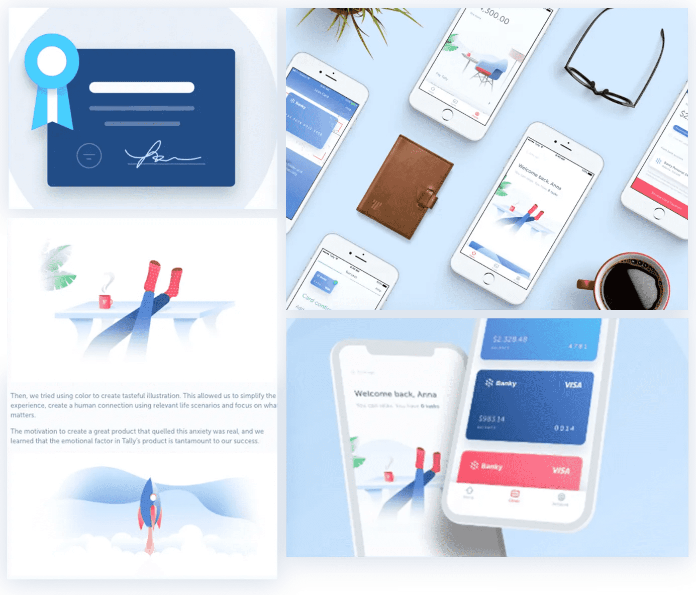
To validate my idea, I researched apps from the insurance and financial industries incorporating visuals, where I came across Tally and Lemonade. Their designs are engaging and clean, and use of illustrated imagery aligns well with Bonzah's visual style. To ensure that illustrations are not only appealing but also functional, I consulted industry articles for guidance, I realized that illustrations can motivate customers to return to the site.
How we solve it
UX Wireframes Review
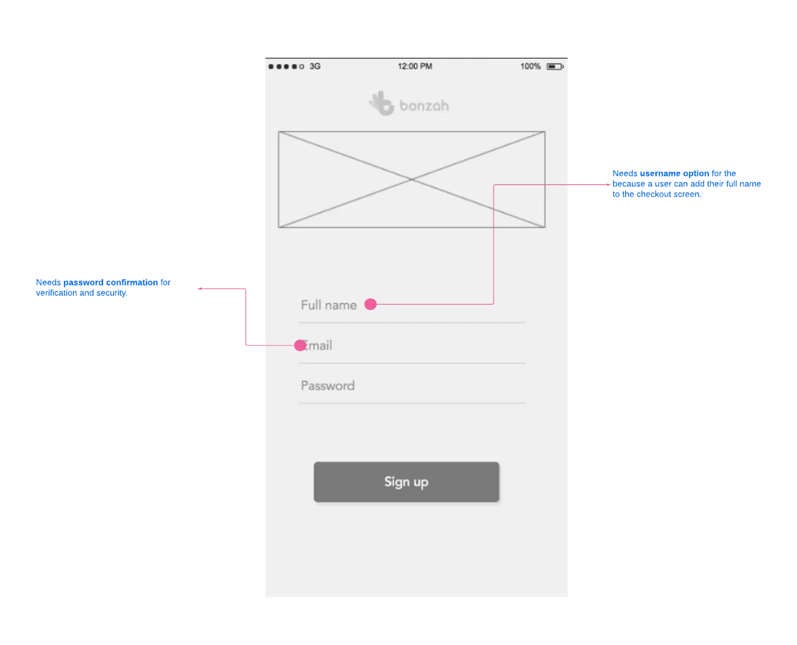
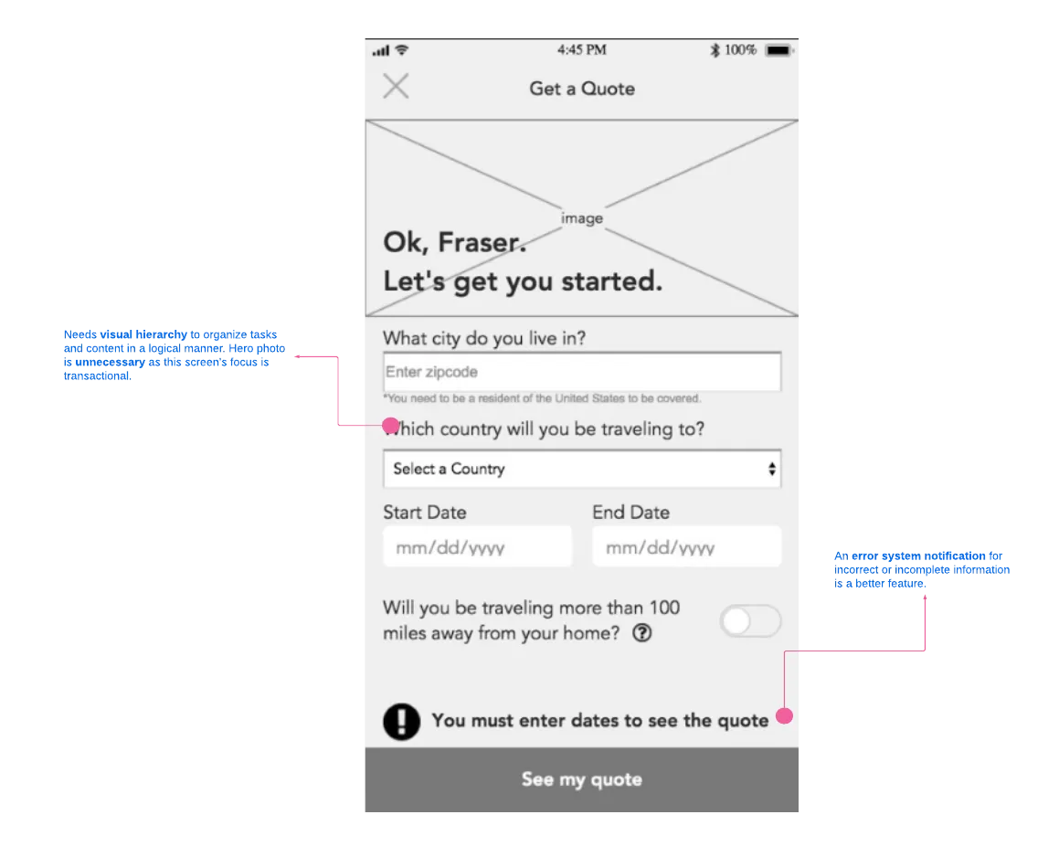
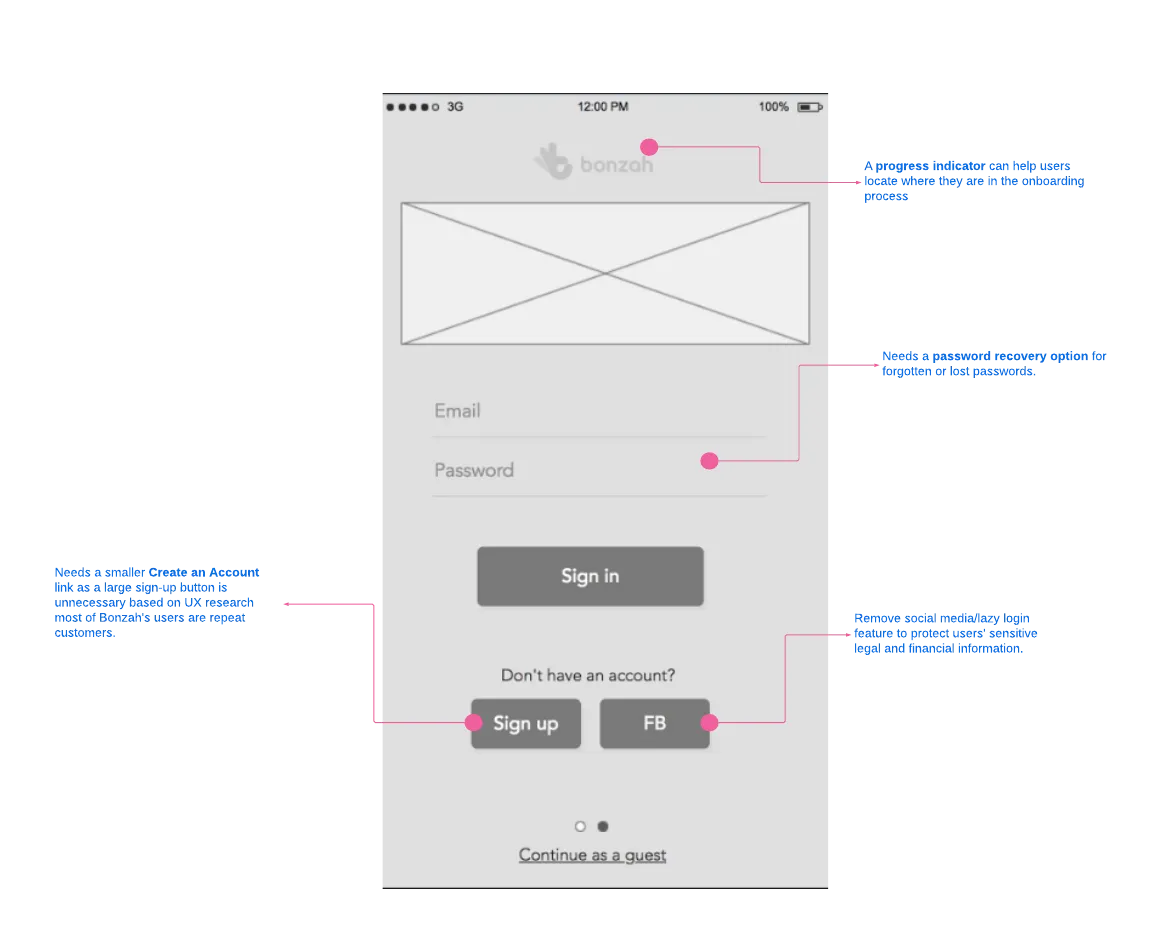
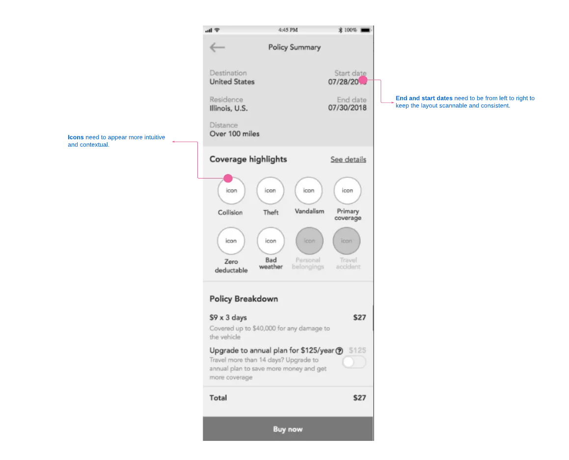
Having a visual idea of Bonzah’s aesthetics, we went ahead and see how it fits into the current UX wireframes. we reviewed the previous UX team's mobile wires for any UX inconsistencies.
Design Principles
After reviewing the initial mobile wires, we identified 3 design principles to guide our final visual solutions. These principles reminded us of Bonzah's customers' priorities: transparency, trustworthiness, simplicity, and ease of use.
Bonzah is Upfront
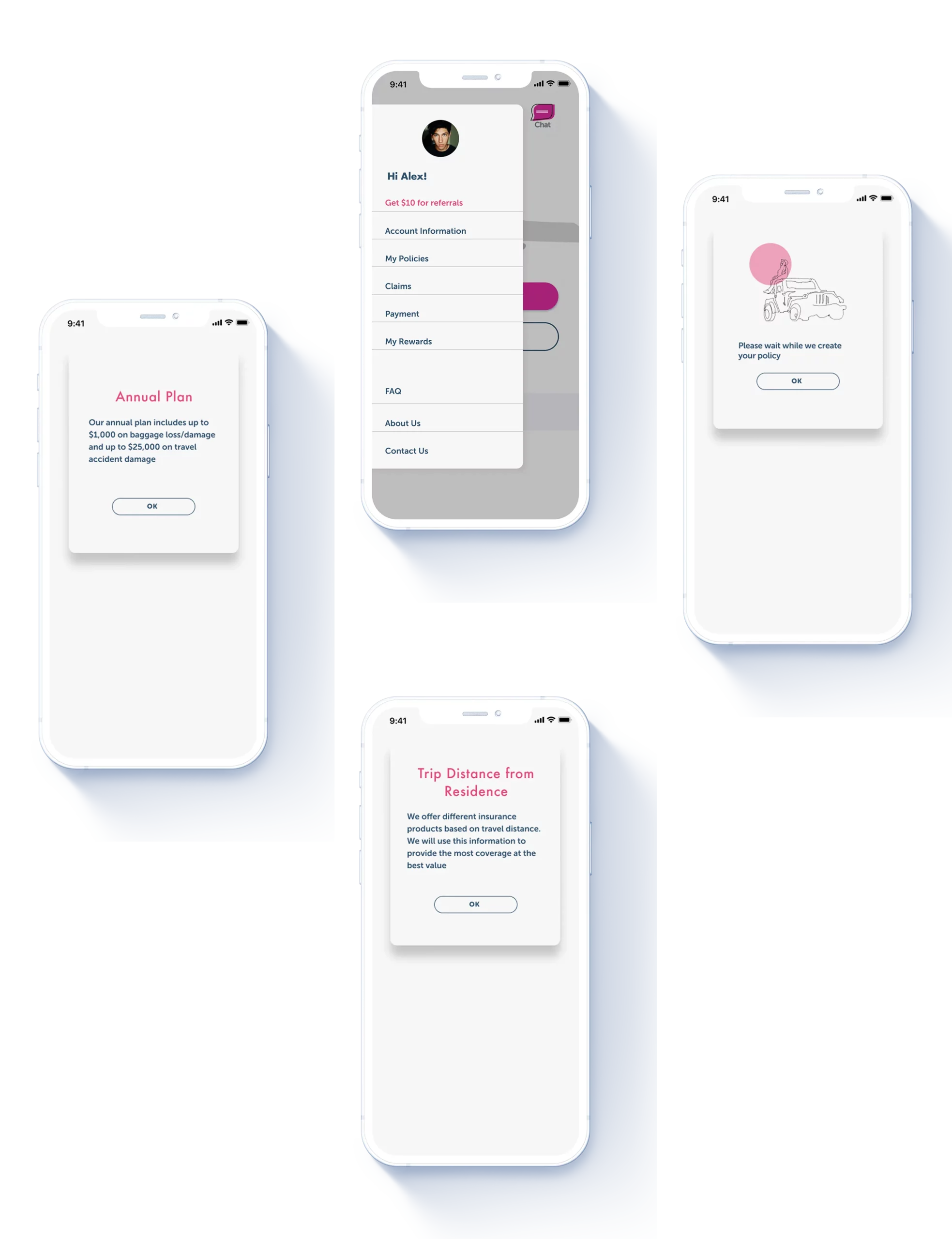
Make it simple for customers to obtain the right information at specific points of the transaction through a guided experience of text and graphics.
Your Mobile Buddy
Communicate trustworthiness, friendliness, and familiarity through an organized and clean layout.
On the Go
Efficient mobile transactions by focusing on essential features redundant styling and distractions.
Homing into Bonzah's brand aesthetic
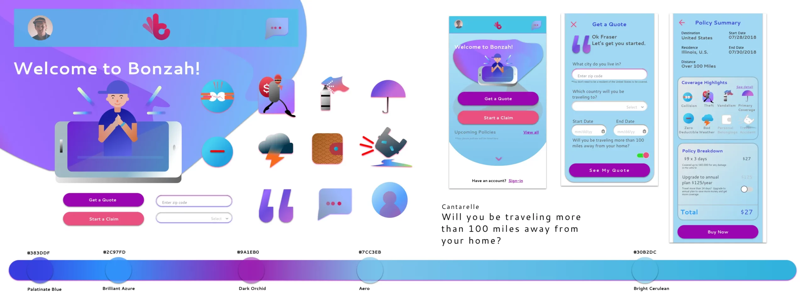
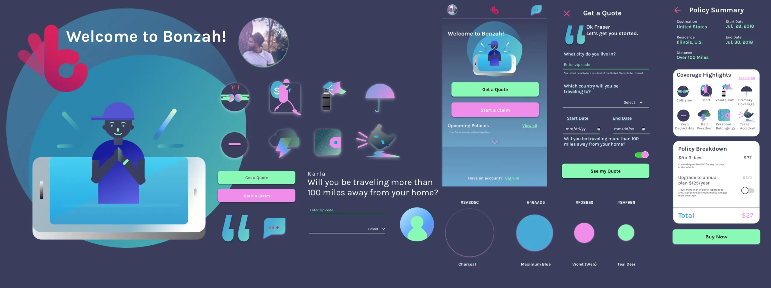
To fully grasp Bonzah's brand aesthetic, I explored different styles, from light-line illustrations to dark backgrounds with reverse text. Although the client did not find any of the styles as a fit for their brand, I did receive positive feedback from user testing. With these insights, I needed to find a way to combine Bonzah's brand aesthetic with directions from user feedback.
Visual solutions
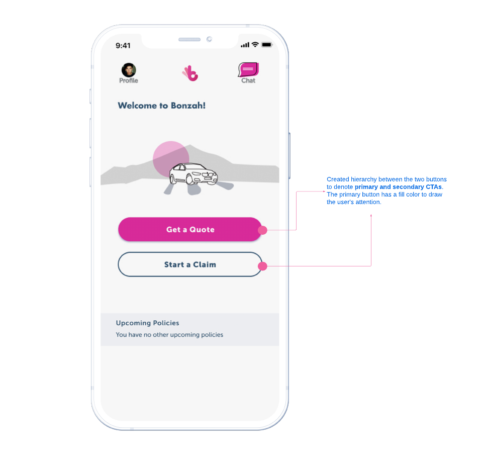
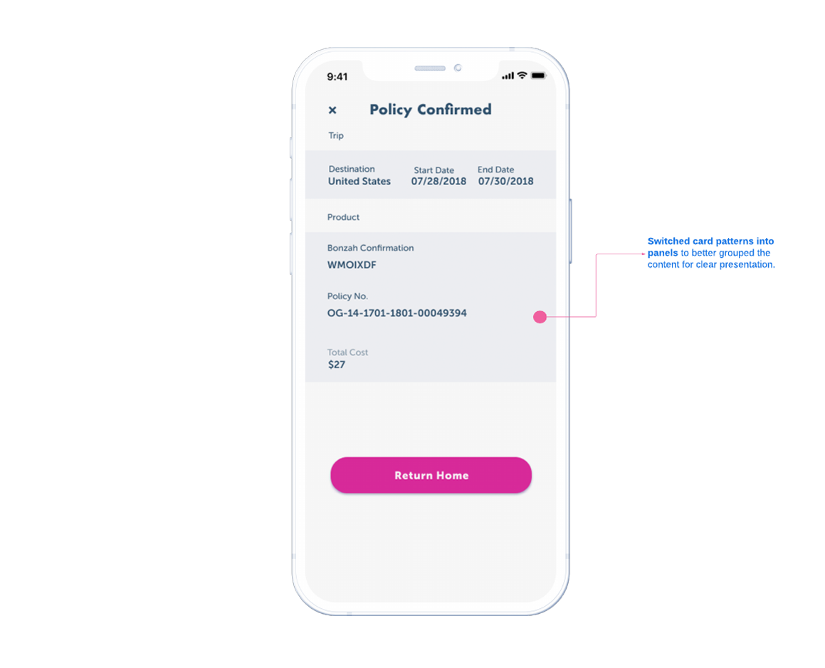
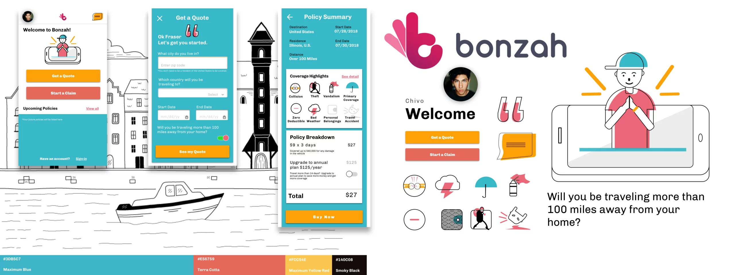
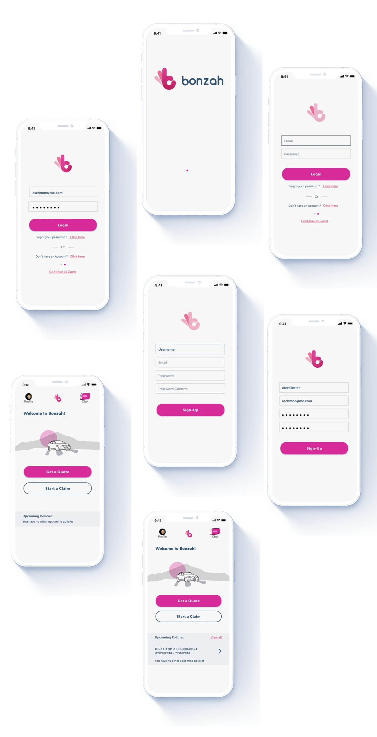
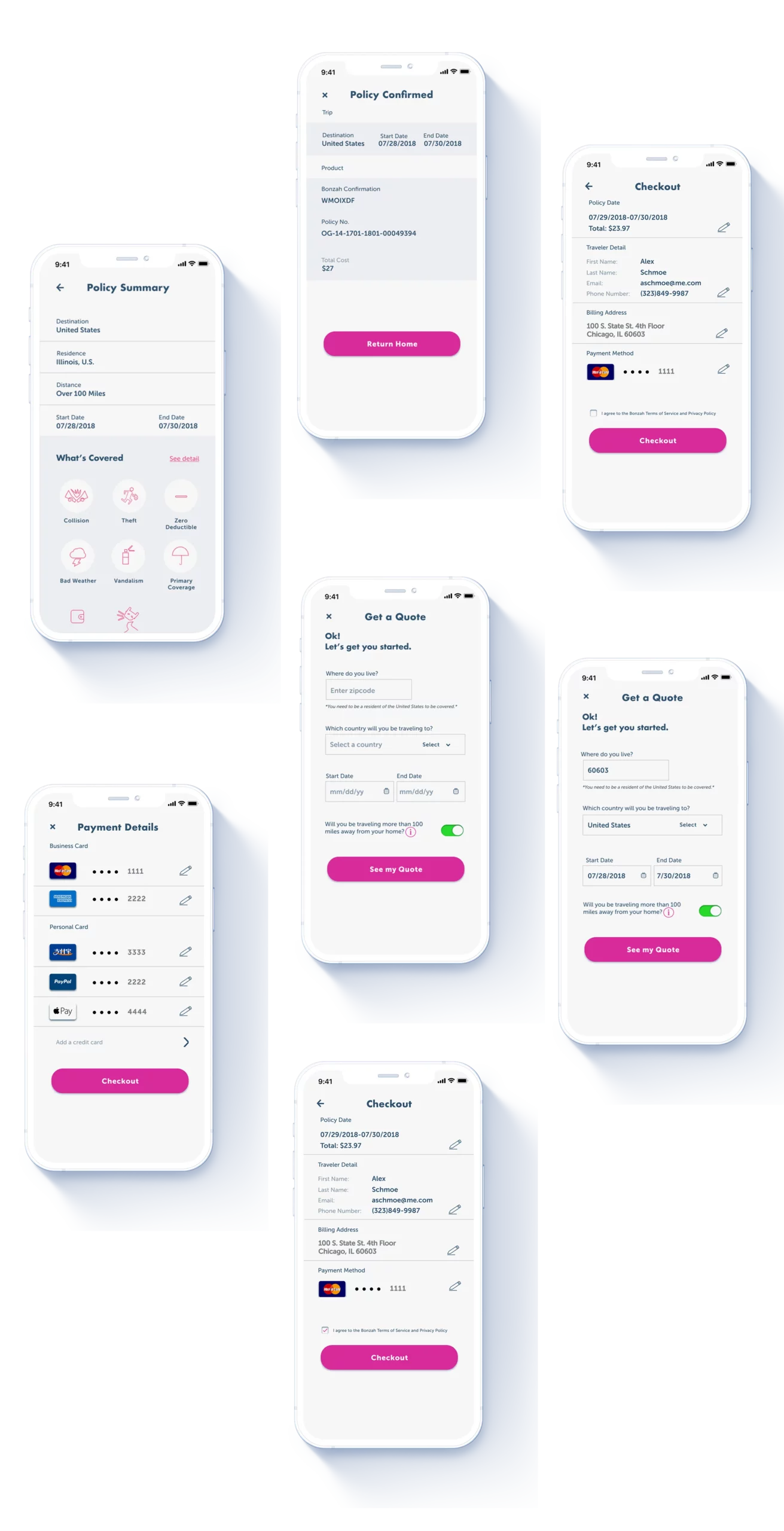
After analyzing the results of the final user test, I was able to merge various visual elements and ideas from my research with Bonzah's brand aesthetic. I created a clear visual hierarchy using size, color schemes, and ample white space with light backgrounds to combine related elements. From my analysis, this method proved effective for content-rich applications like Bonzah's mobile app.
Outcomes
3x
Prototype testing and iterations. Our testers found the new look and layout as modern, clean, and trustworthy.
3.2019
iOS launched with elements from my design.

We ended up going with Wig’s design, given the simplicity of it, which matched our Bonzah brand strategy.
Steve Sherlock, Co-Founder and CEO at Bonzah Mobility
What else is left?
I learned to test my assumptions and expect possible changes continually. More importantly, I must widen my perspective when dealing with future clients.
I learned to discern between the client's initial wants versus their goals. Here, I demonstrated my visual solution's feasibility and overcame Steve's initial apprehension by focusing on user needs and insights.
It would not have been possible if I could not identify Bonzah's genuine need. In this case, we needed to instill trust in its users through transparency. The visual solution was prioritizing content and using graphics to support that need.
Although this was a freelance and my final Designation project, it's just the beginning of my journey. Looking back at this experience, I realized that visual designs go hand-in-hand with UX solutions to deliver a usable and equitable product.
Selected Works
Created in Earth, Sol System
